Hurray!
It´s been a hard couple of weeks, but now I´m finally there. My project exam, and my portfolio is done, and I can start enjoying december, snow and christmas!
Hurray!
It´s been a hard couple of weeks, but now I´m finally there. My project exam, and my portfolio is done, and I can start enjoying december, snow and christmas!
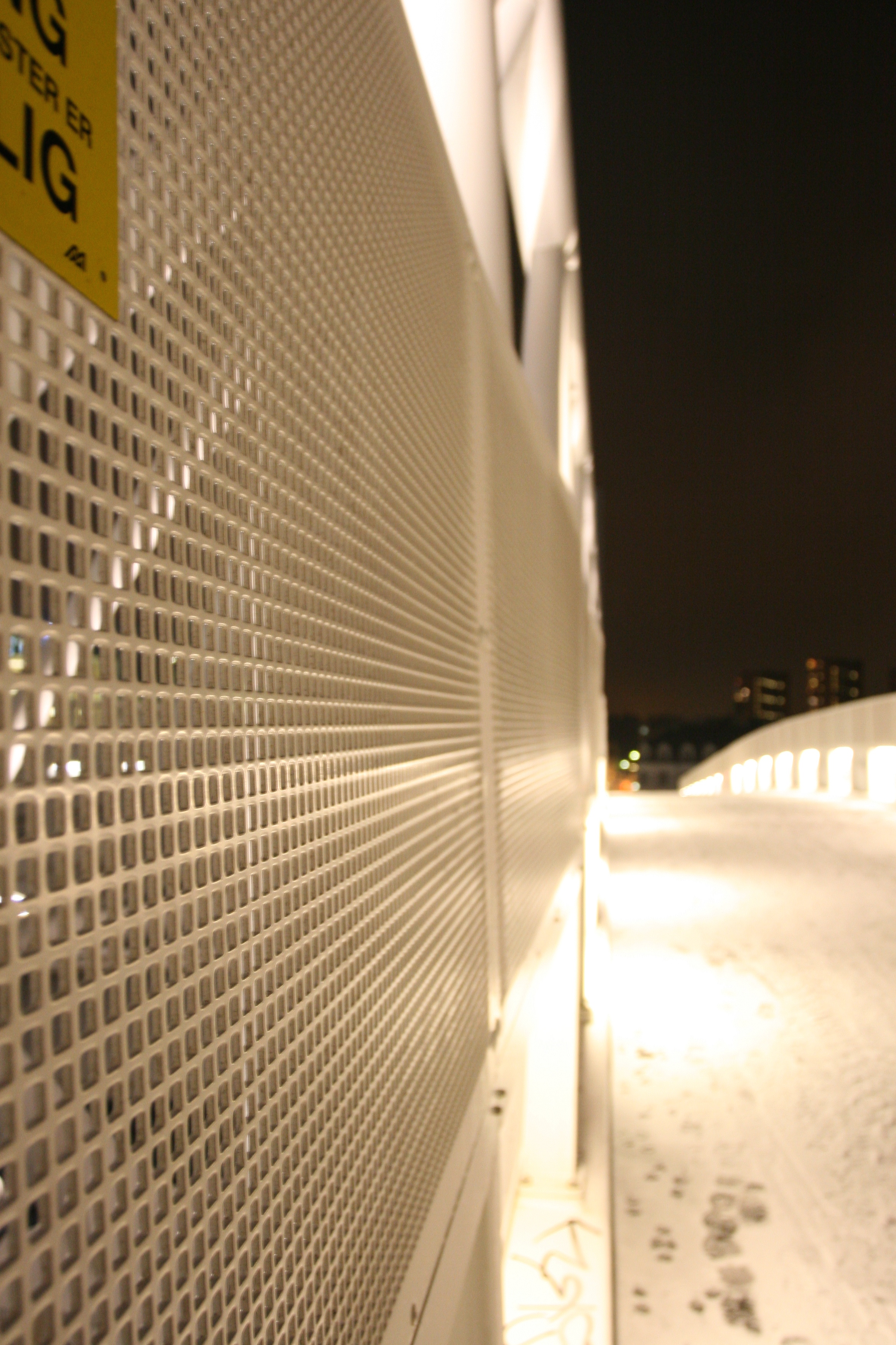
Night Photo

ISO: 800
Focal lenght: 17mm
Aperture: f/5
Shutter speed: 1/5
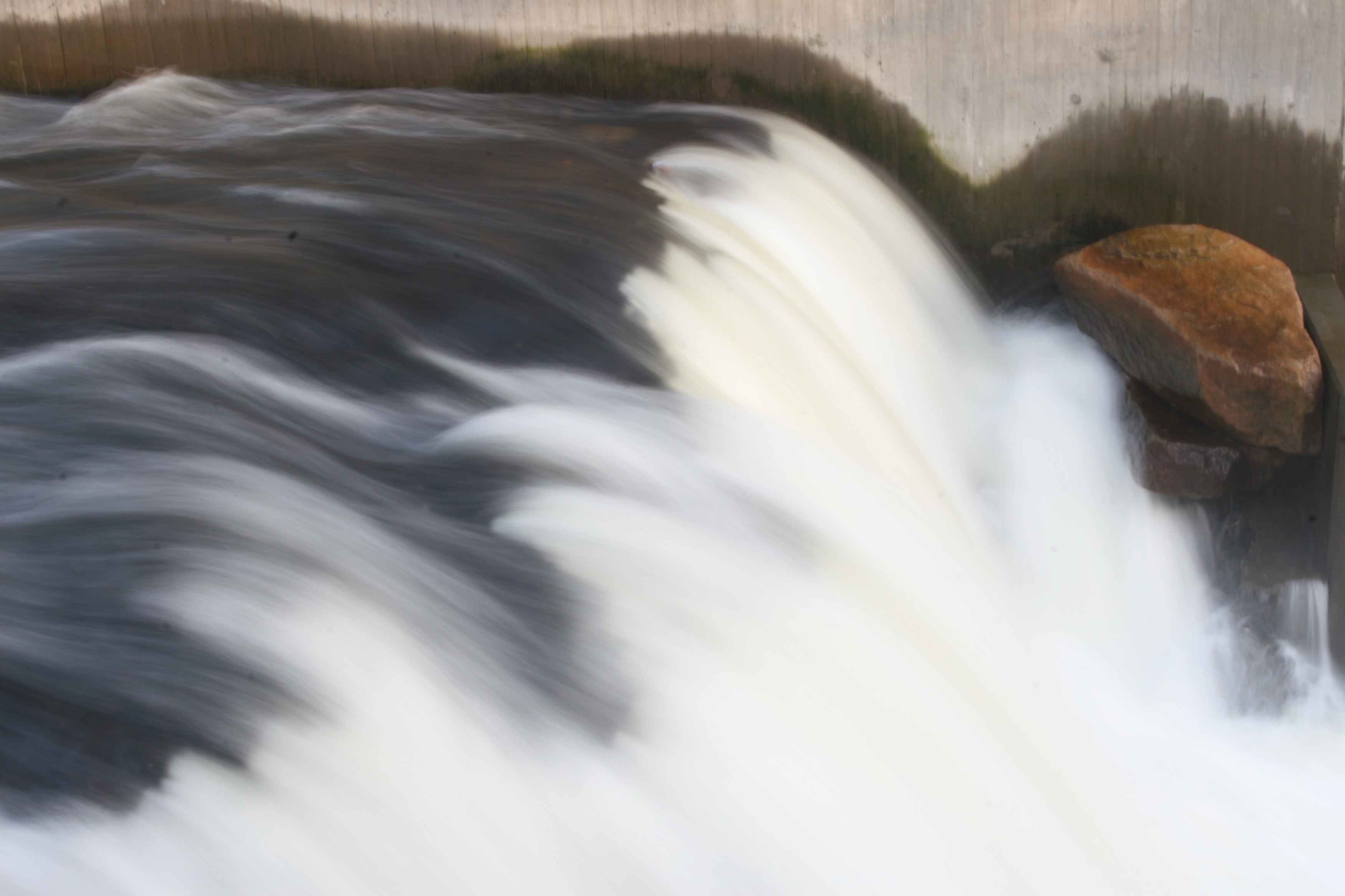
Freeze water
ISO: 400
Focal lenght: 32mm
Aperture: f/4
Shutter speed: 1/60
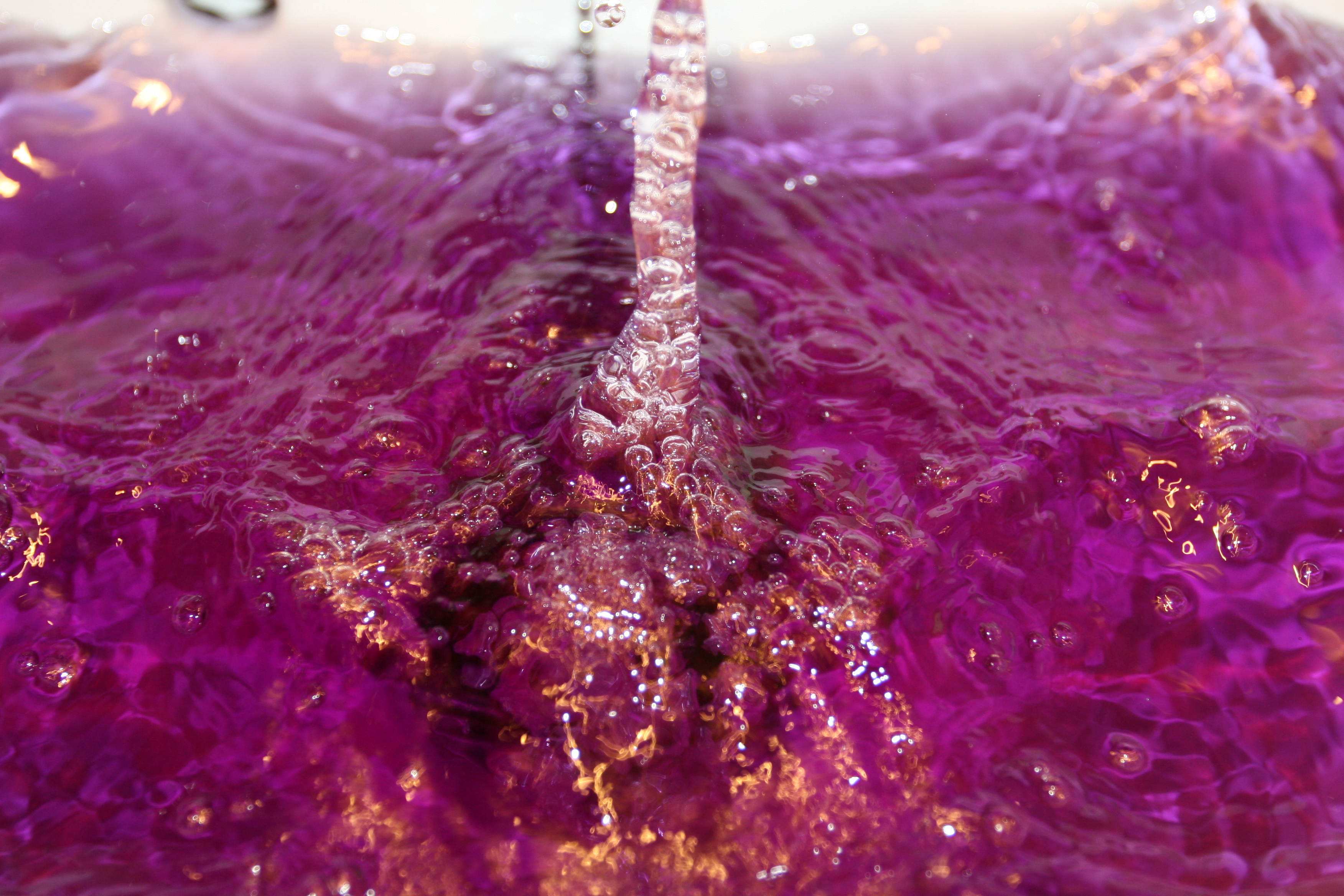
“Misty/Veil”
ISO: 100
Focal lenght: 35mm
Aperture: f/25
Shutter speed: 1/2
“The golden section”

ISO: 800
Focal lenght: 39mm
Aperture: f/5
Shutter speed: 1/5
Motion
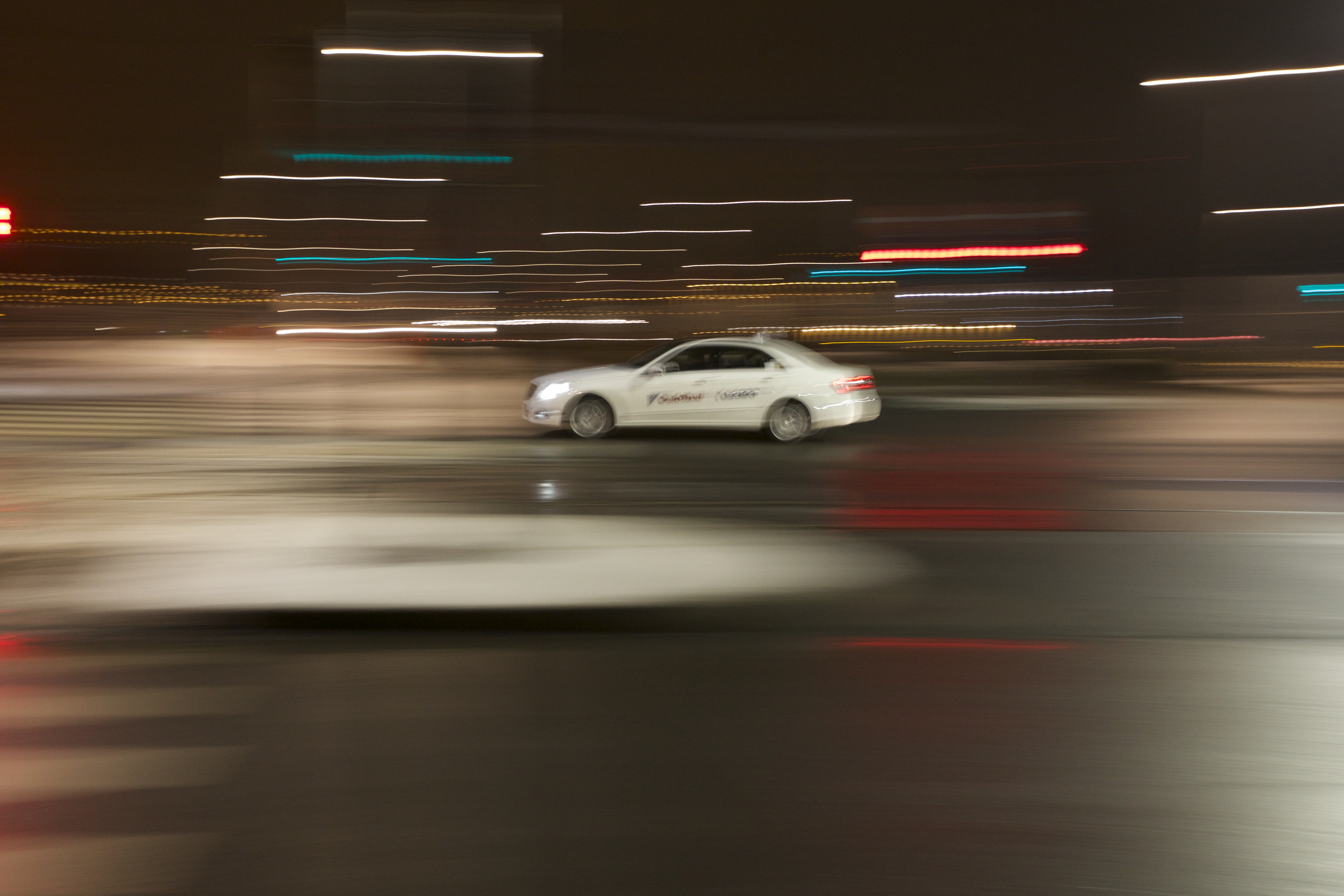
ISO: 1250
Focal lenght: 40mm
Aperture: f/9
Shutter speed: 1/4
Contrast
ISO: 800
Focal lenght: 34mm
Aperture: f/4,5
Shutter speed: 1/125
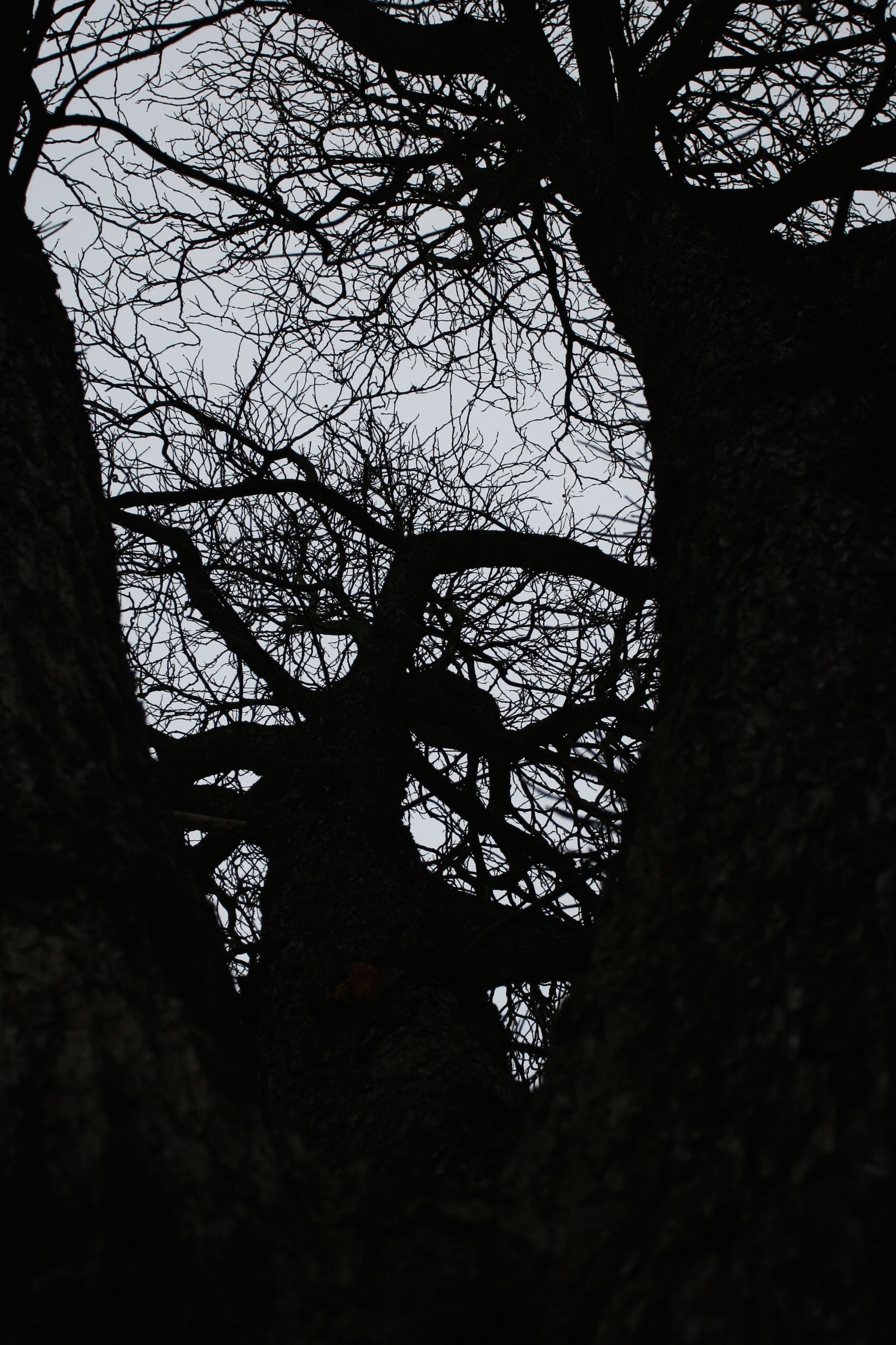
Low key
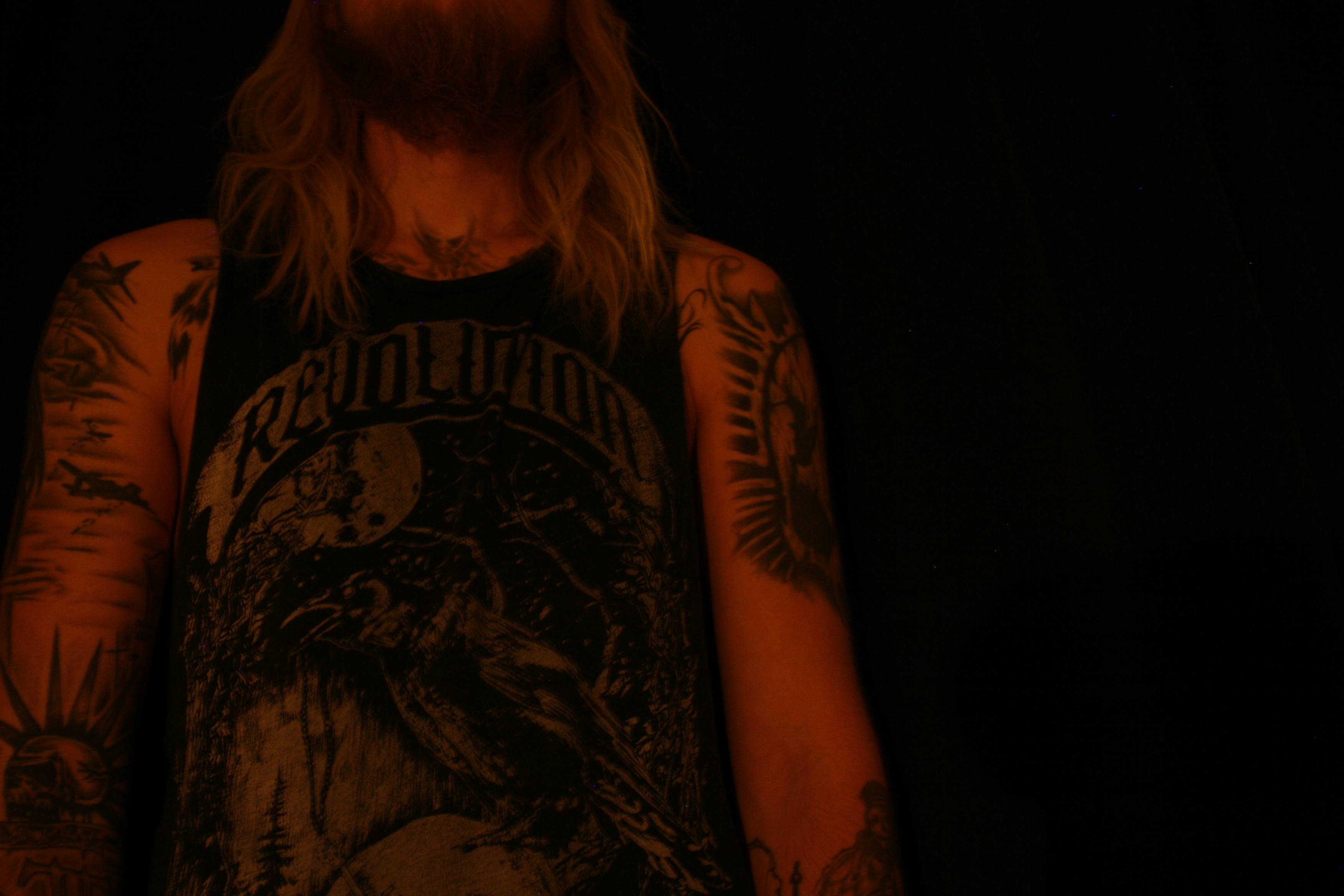
ISO: 400
Focal lenght: 19mm
Aperture: f/4
Shutter speed: 2,0
Curves and lines
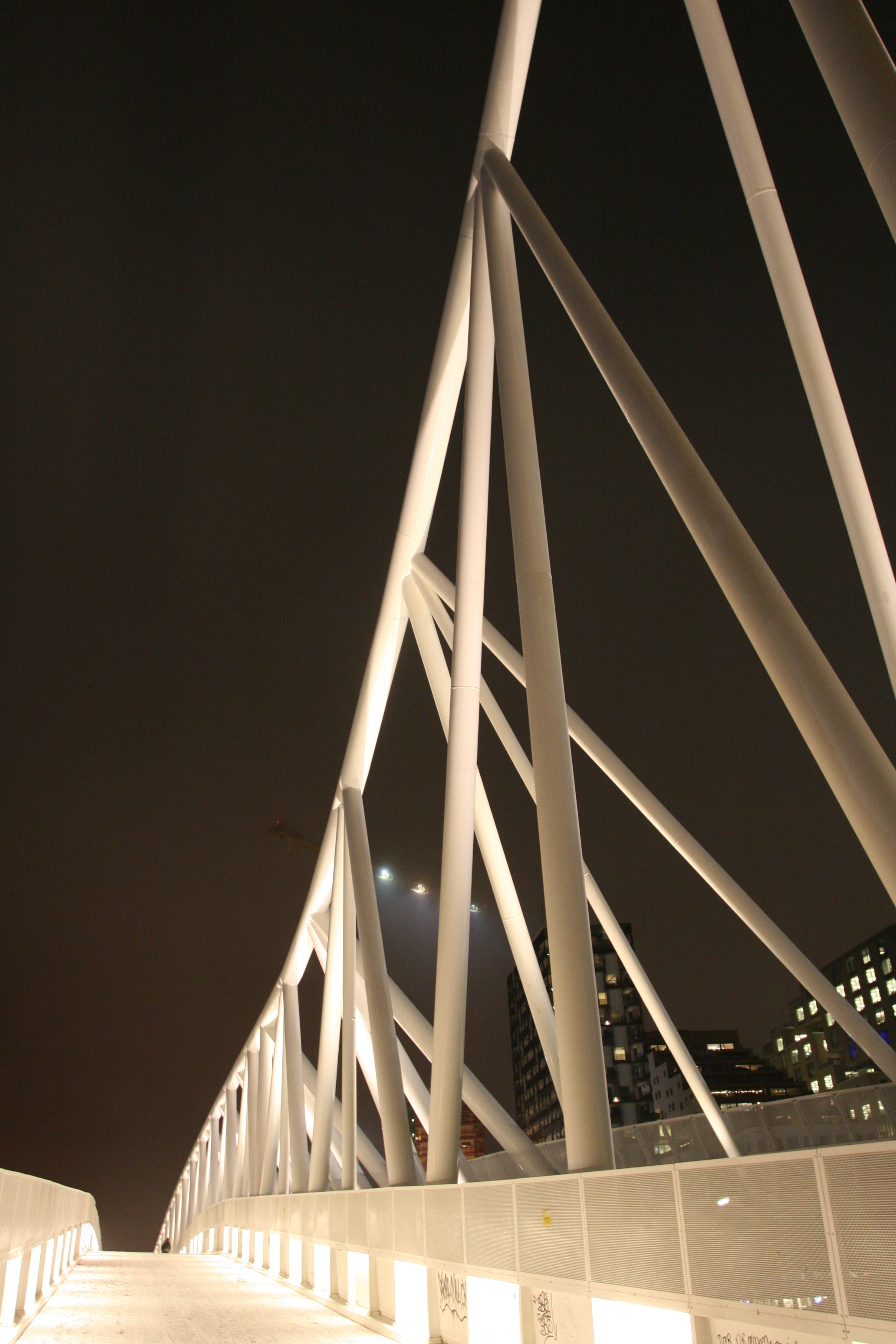
ISO: 800
Focal lenght: 17mm
Aperture: f/4,5
Shutter speed: 1/5
Drawing with light
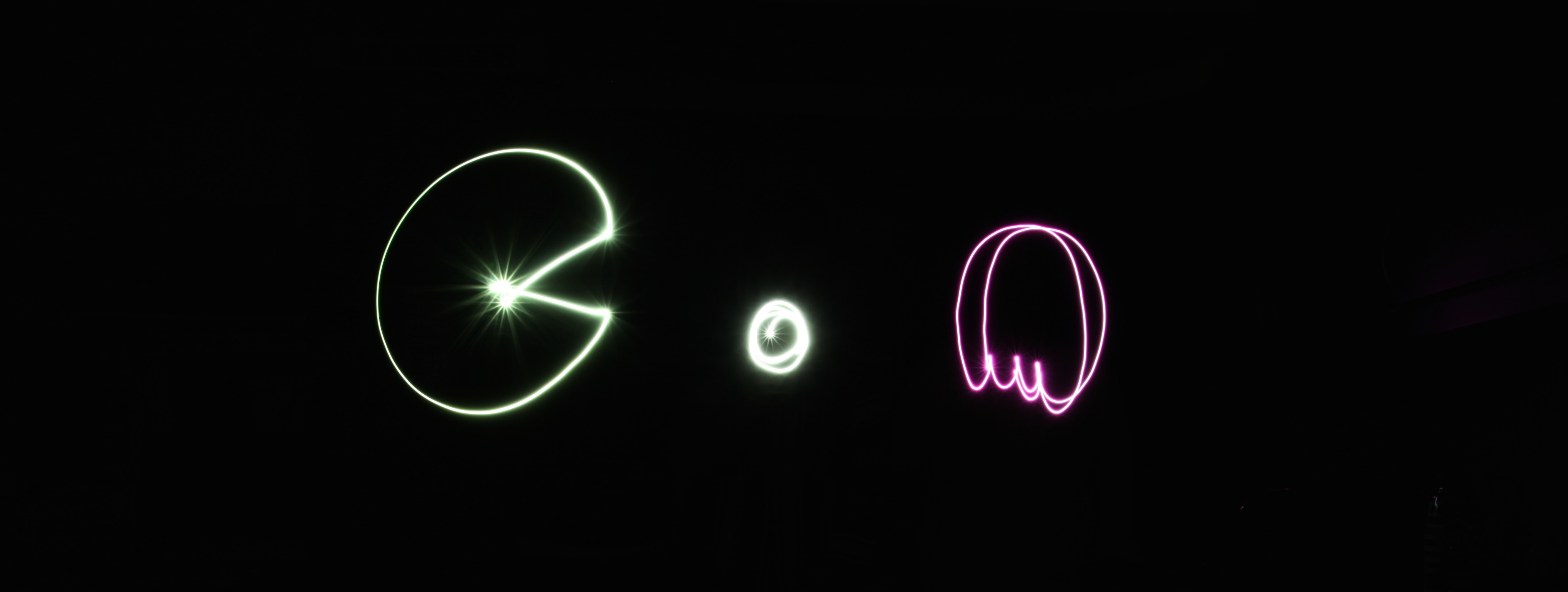
ISO: 100
Focal lenght: 24mm
Aperture: f/22
Shutter speed: 6,0
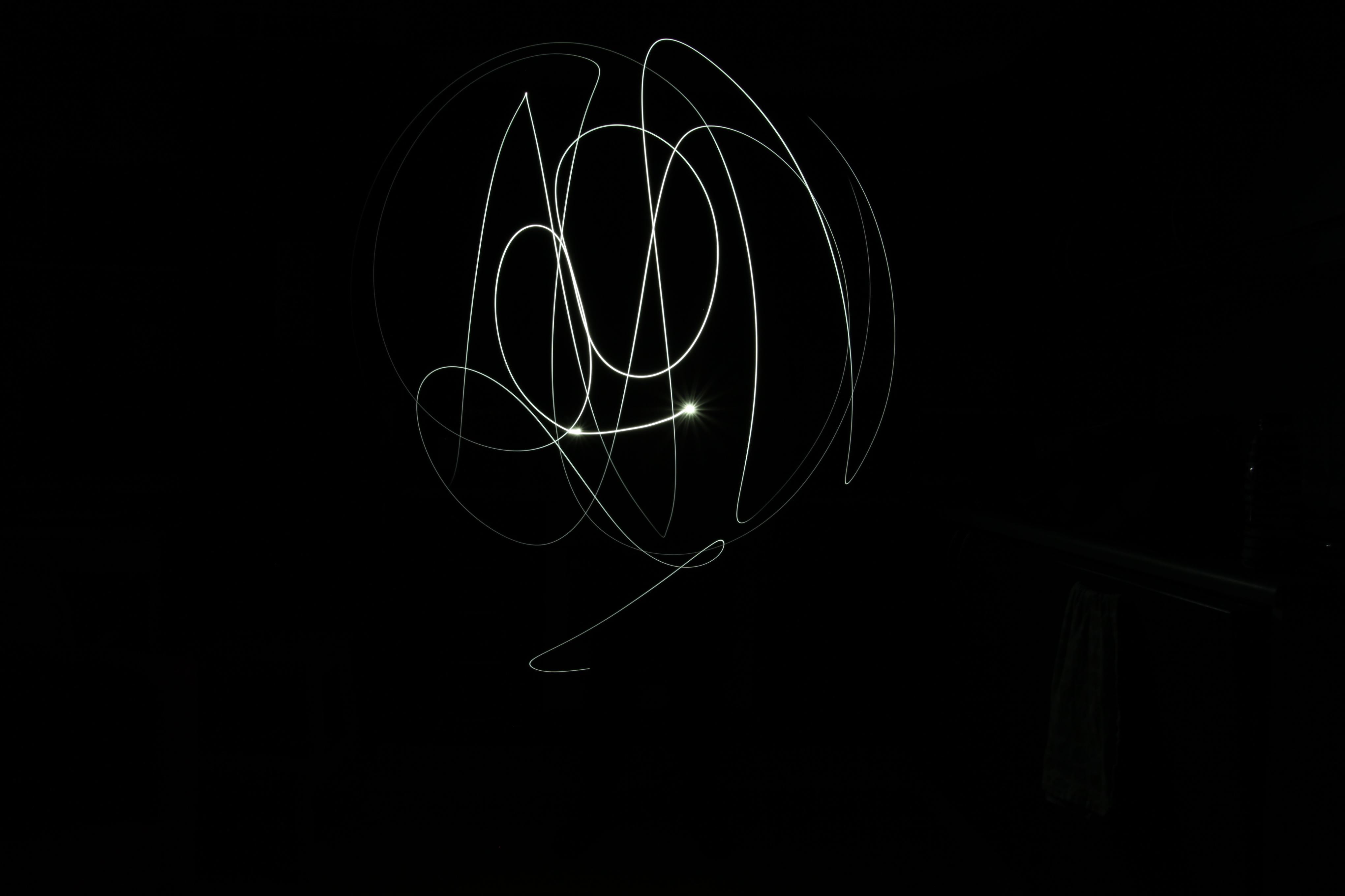
ISO: 100
Focal lenght: 24mm
Aperture: f/22
Shutter speed: 8,0
Depht
ISO: 800
Focal lenght: 17mm
Aperture: f/5
Shutter speed: 1/5
In this assignment I had to design a 4-page brochure for a fictitious travel agent, in inDesign. The size of the brochure was to be A5, when folded, and It had to be in full color.
My result

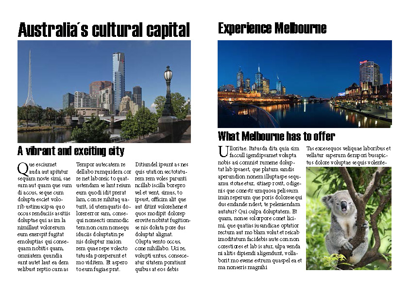
Image source
Cover photo- Image courtesy of Donaldytong at commons.wikimedia.org
Eureka tower- Image courtesy of Donaldytong at commons.wikimedia.org
Koala- Image courtesy of M – Pics at FreeDigitalPhotos.net
Melbourne docklands- Photo by DAVID ILIFF. License: CC-BY-SA 3.0 at commons.wikimedia.org
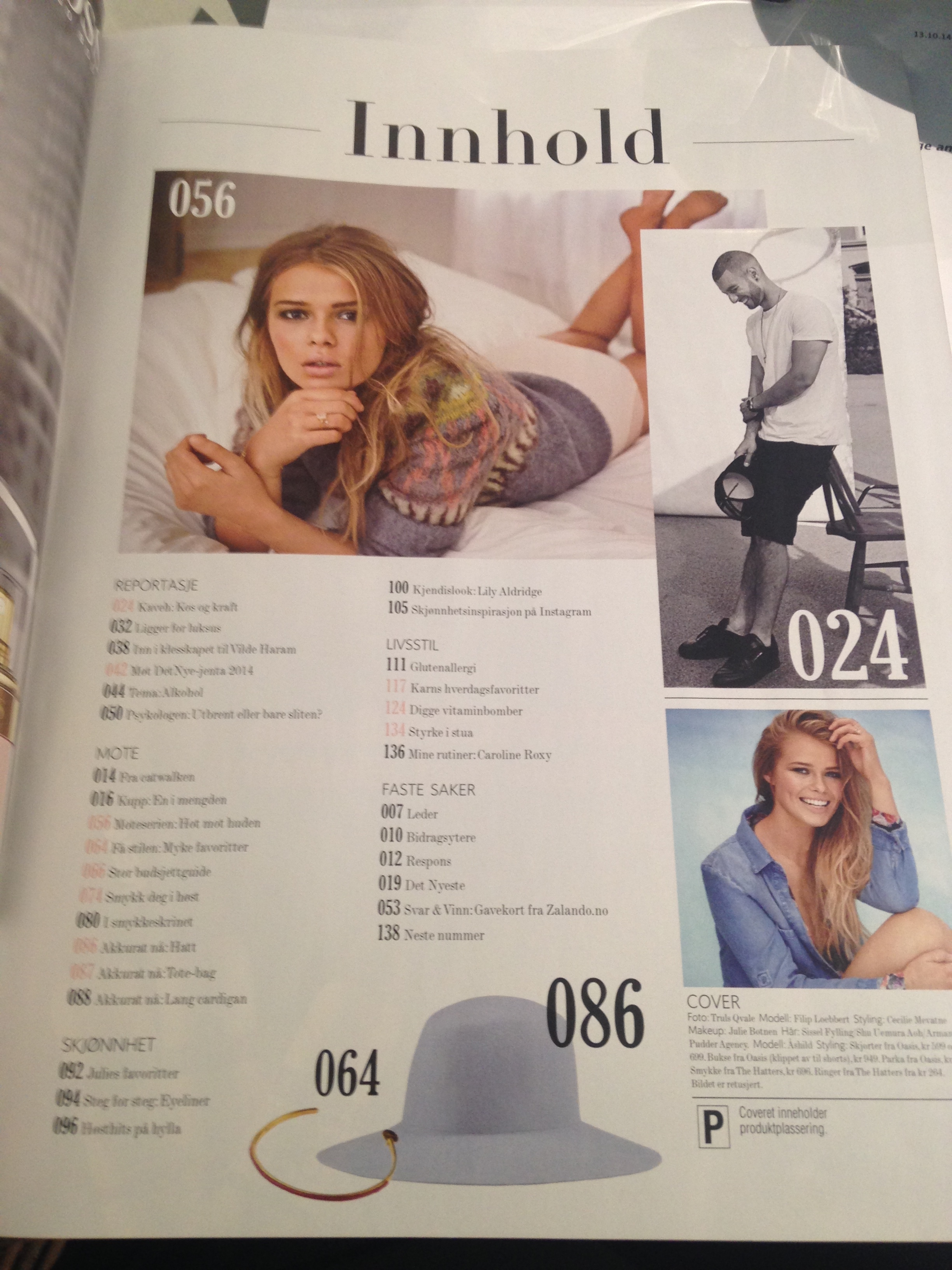
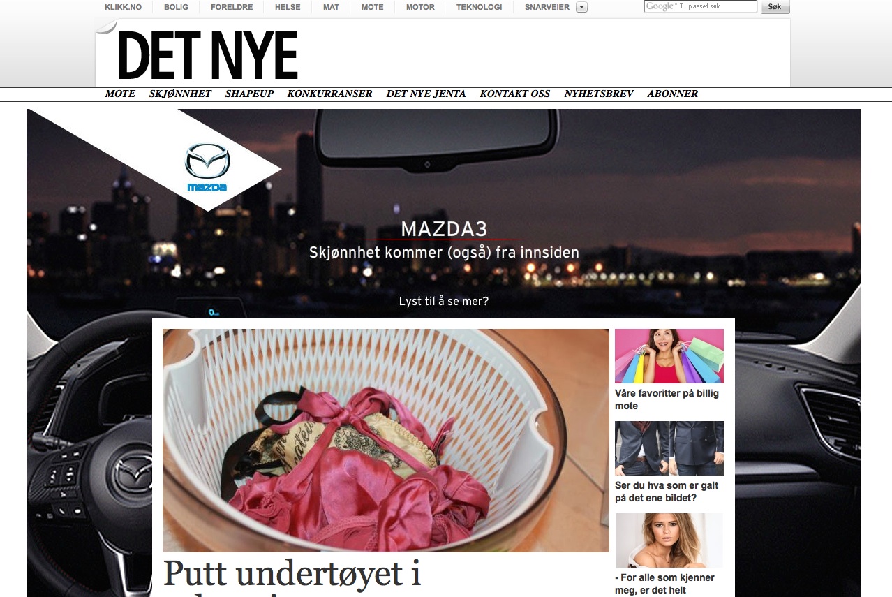
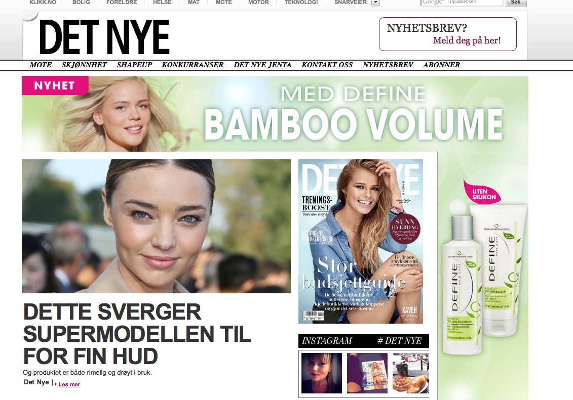
In this activity we were to compare a online magazine, blog or website, to a printed magazine, book or journal. We were asked what difference we can see in the strategies used for the two formats.
I chose the norwegian magazine Det Nye, both in printed version and the website of the magazine. The main difference between the printed version and the web version, is the layout of the magazine. In the printed one the cover has to include the top articles which you find inside the magazine, and it has to make you interested in reading/buying it.
The web version of the magazine is more packed with articles, and I find the homepage kind of unorganized and cluttered. But at the same time it is easy to navigate to the different topics and categories I want to read more about.
Both the printed version and the web version has a clean and simple look, but the printed magazine feels more luxurious. I think this is a part of the strategy of the design, that the printed version should feel more luxurious and special, and the web version is more simple and straight forward.
The one thing I really like about the web version of the magazine, is that the menubar on top, with all the categories of the magazine, stays the same on every page you navigate to. This makes it easy to stay orientated when you look at different articles. The printed magazine is also separated into different categories which makes it easy to find a specific article inside the printed magazine.
Printed magazine


Web magazine
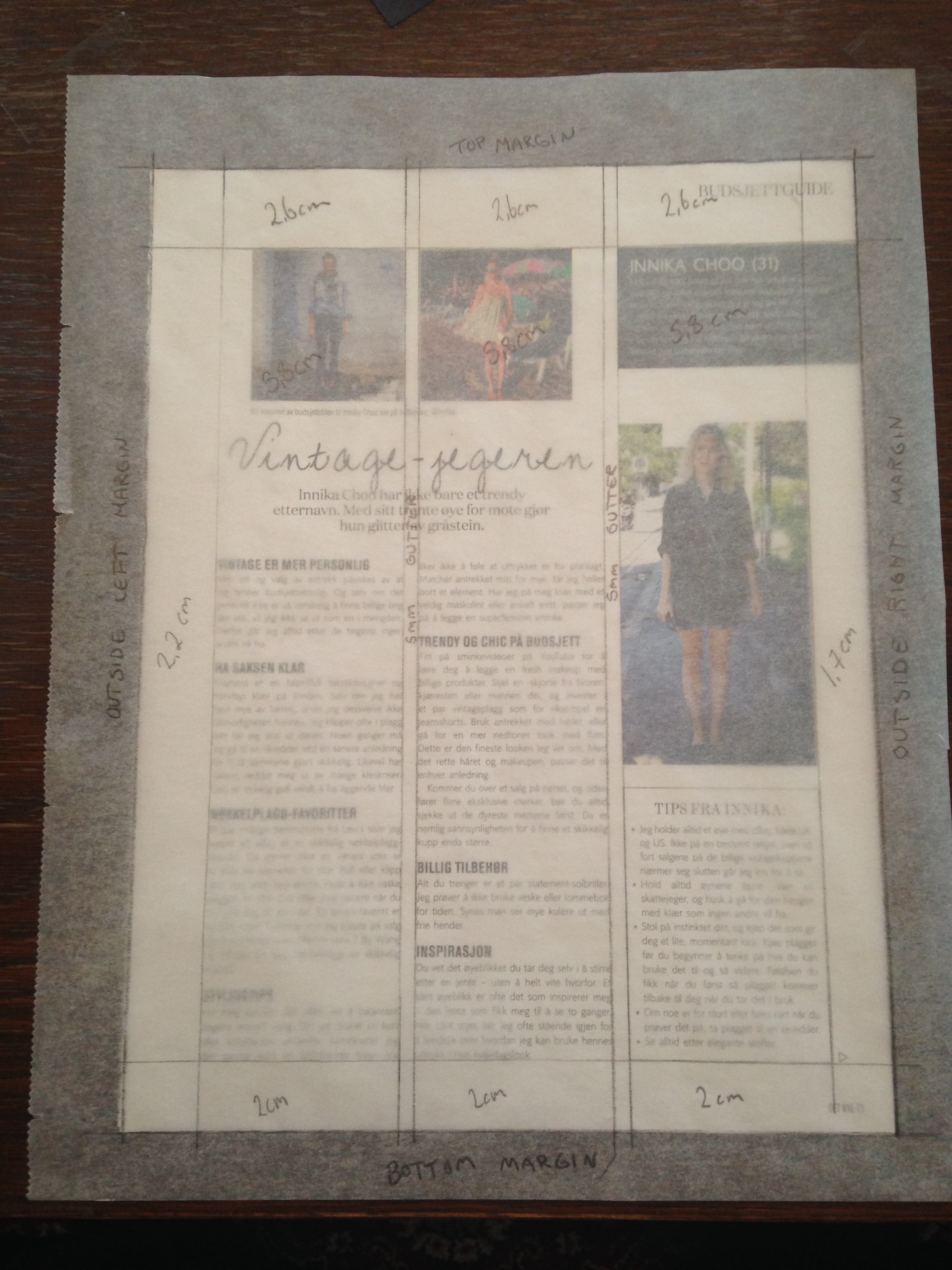
For this task we were supposed to take a magazine, and lay a tracing paper over three pages creating a grid. We were to use both right-hand pages and left-hand pages.
The paged I chose were based on a three-column grid, and on the only thing that changed on the three pages was the bottom margin on one of the pages. I was surprised about this because I thought the three pages looked really different at first. But when I traced the grid over it I could clearly see that it was the same layout in almost the entire magazine.


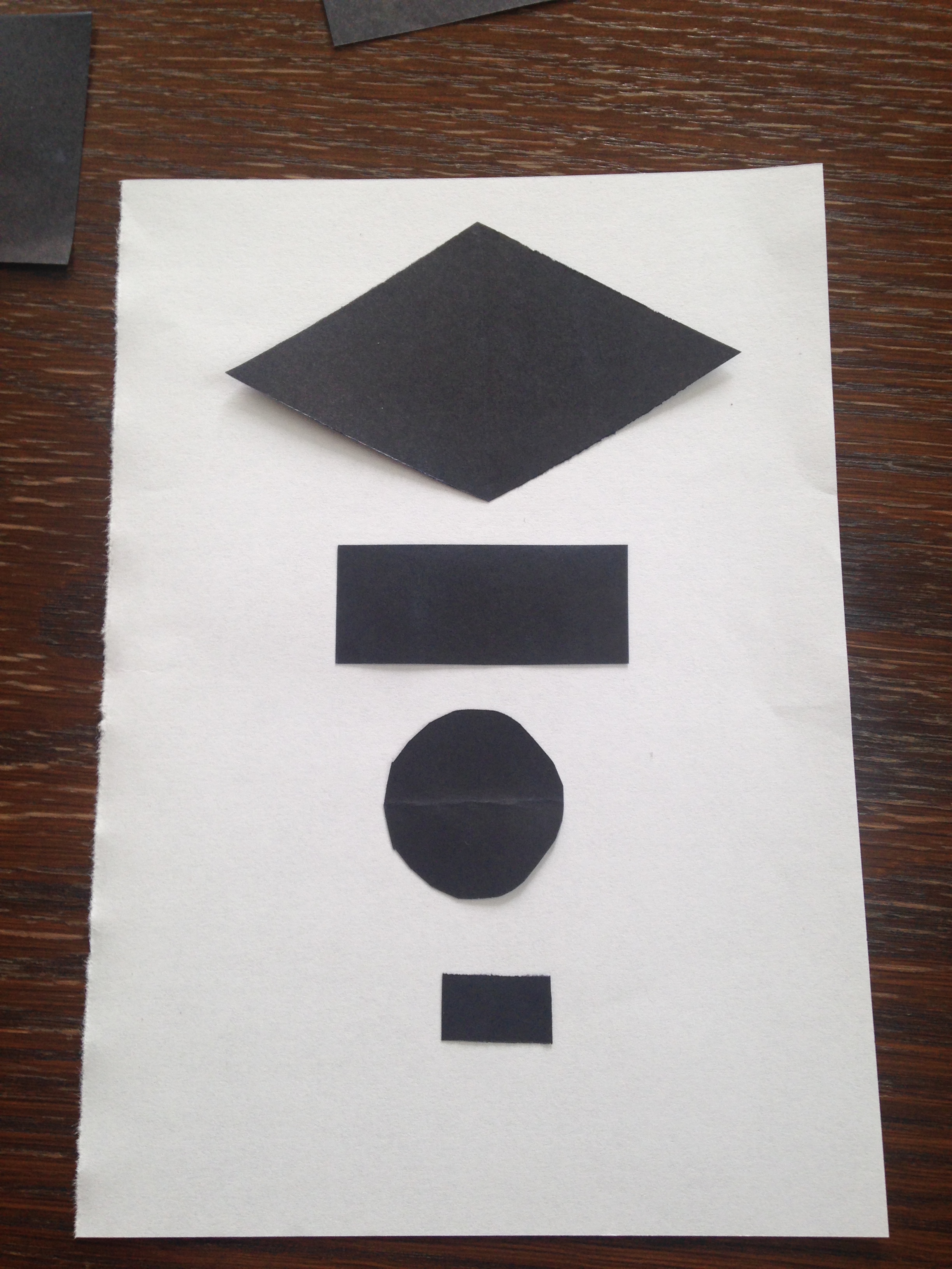
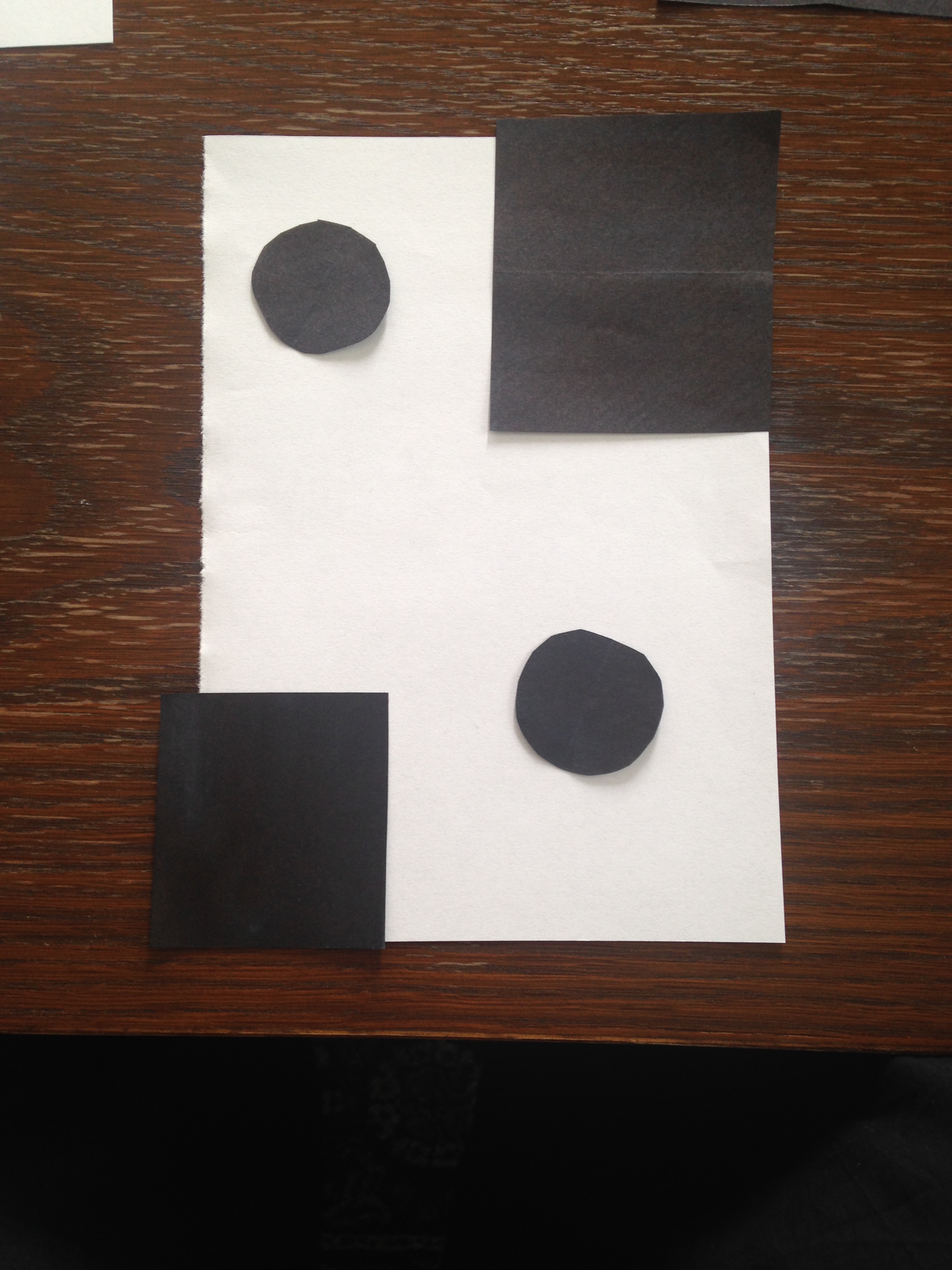
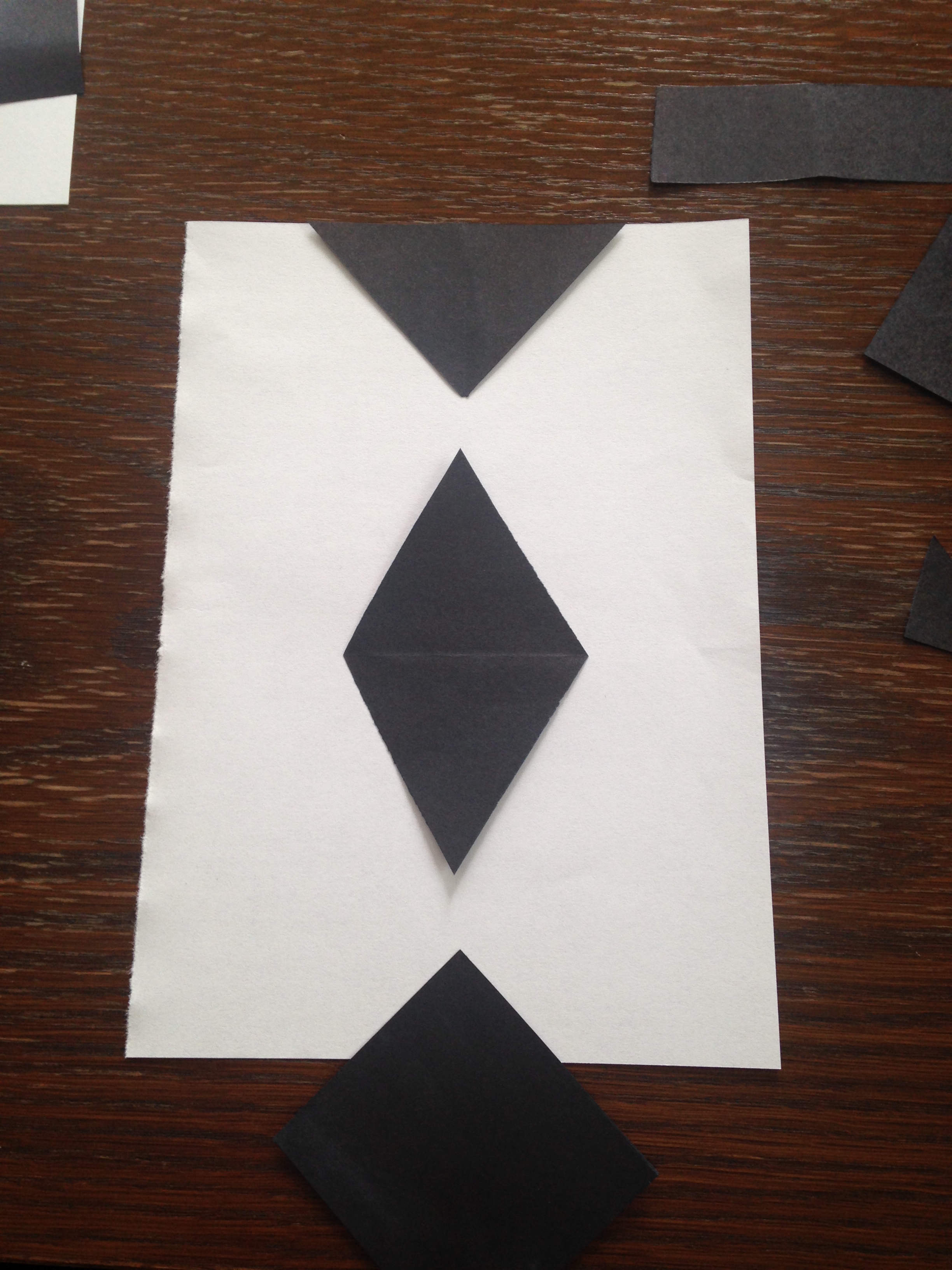
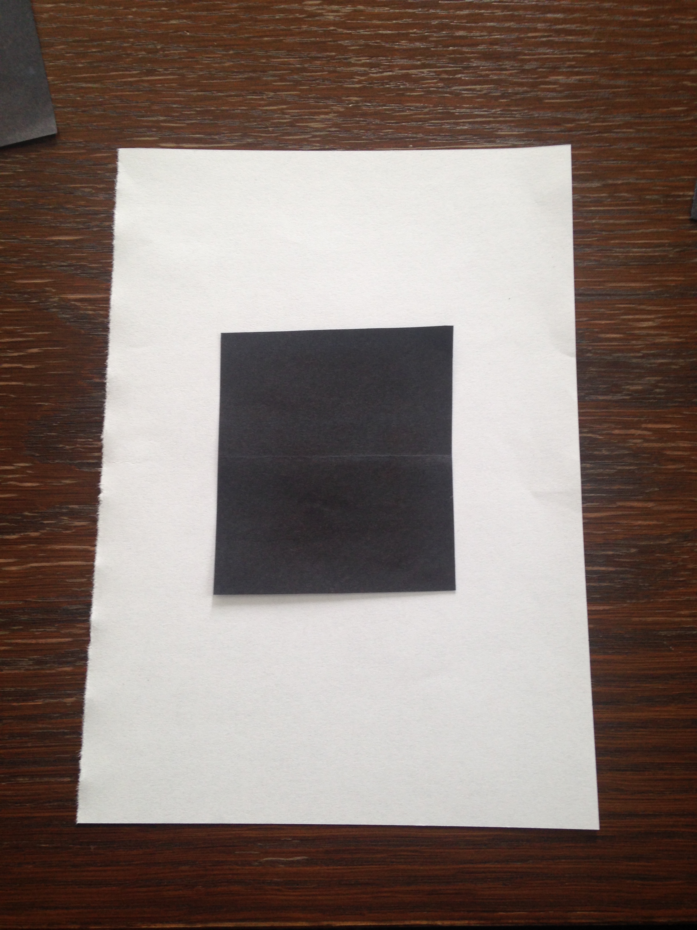
The second task was to cut out figures from black paper, and put these on top of a white paper. The goal was to find out at which point the figures disappear into the ground.
I find that when the black figures are centered in the middle of the white paper, you clearly see the white as a background. If I put the black figures along the edge of the white paper however, the figures disappears into the ground. It is not necessarily the dominant color that becomes the background, but the way the black and white is laid out.


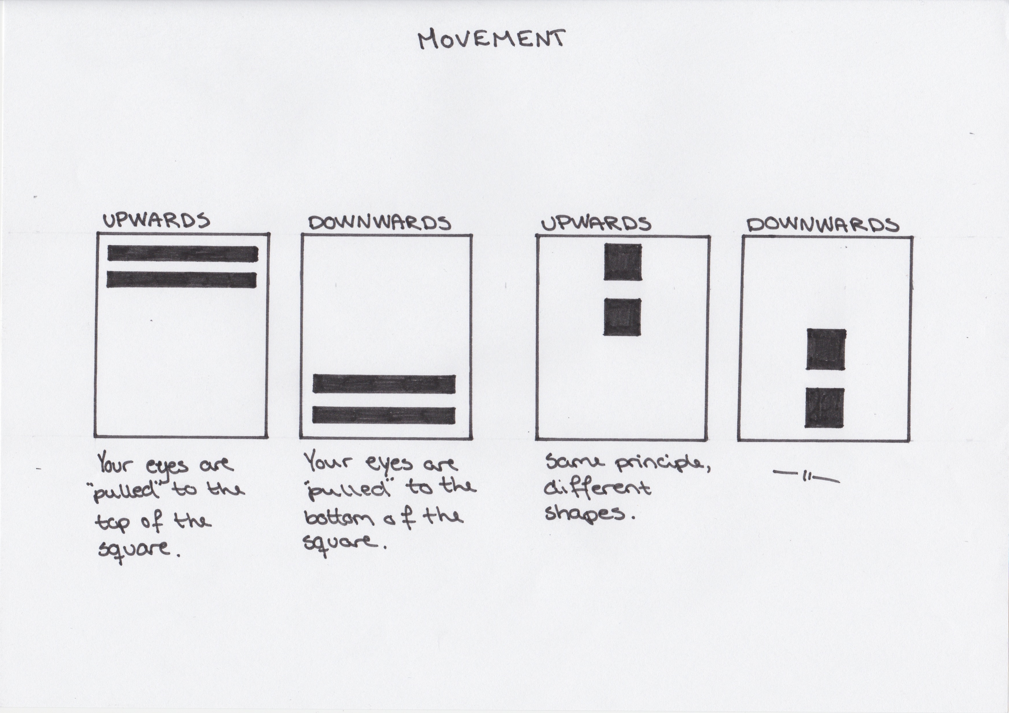
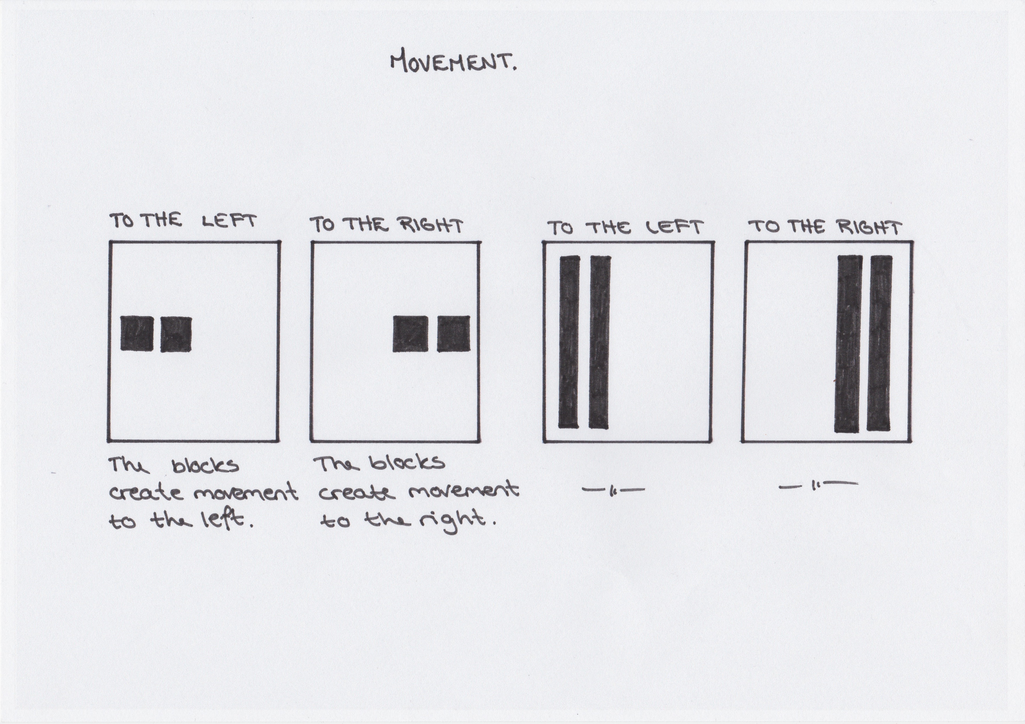
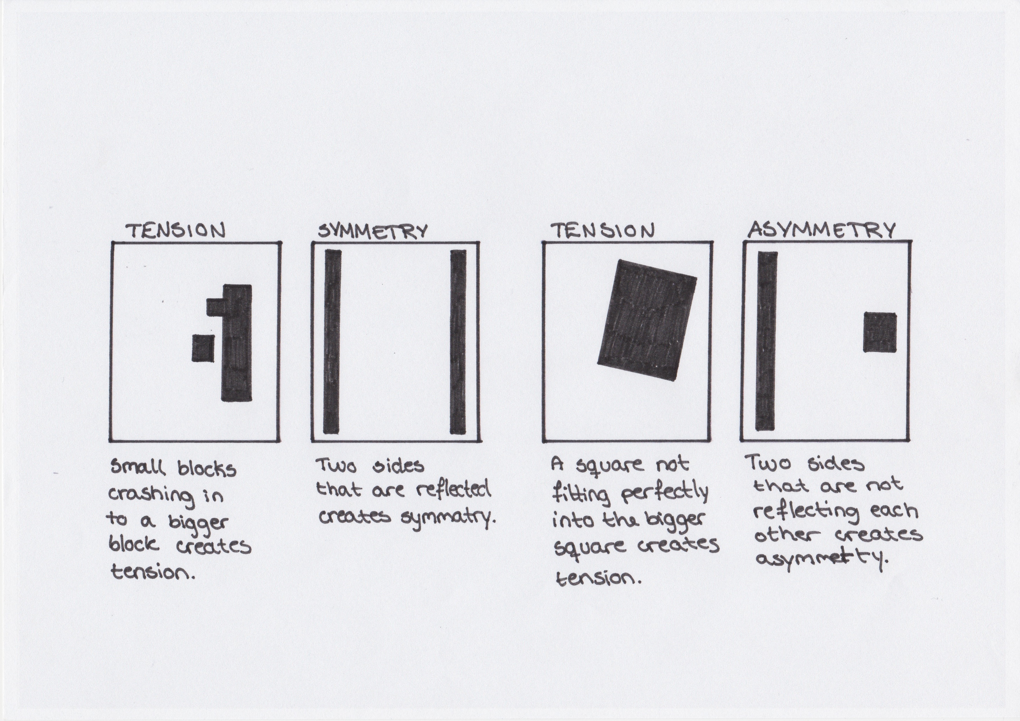
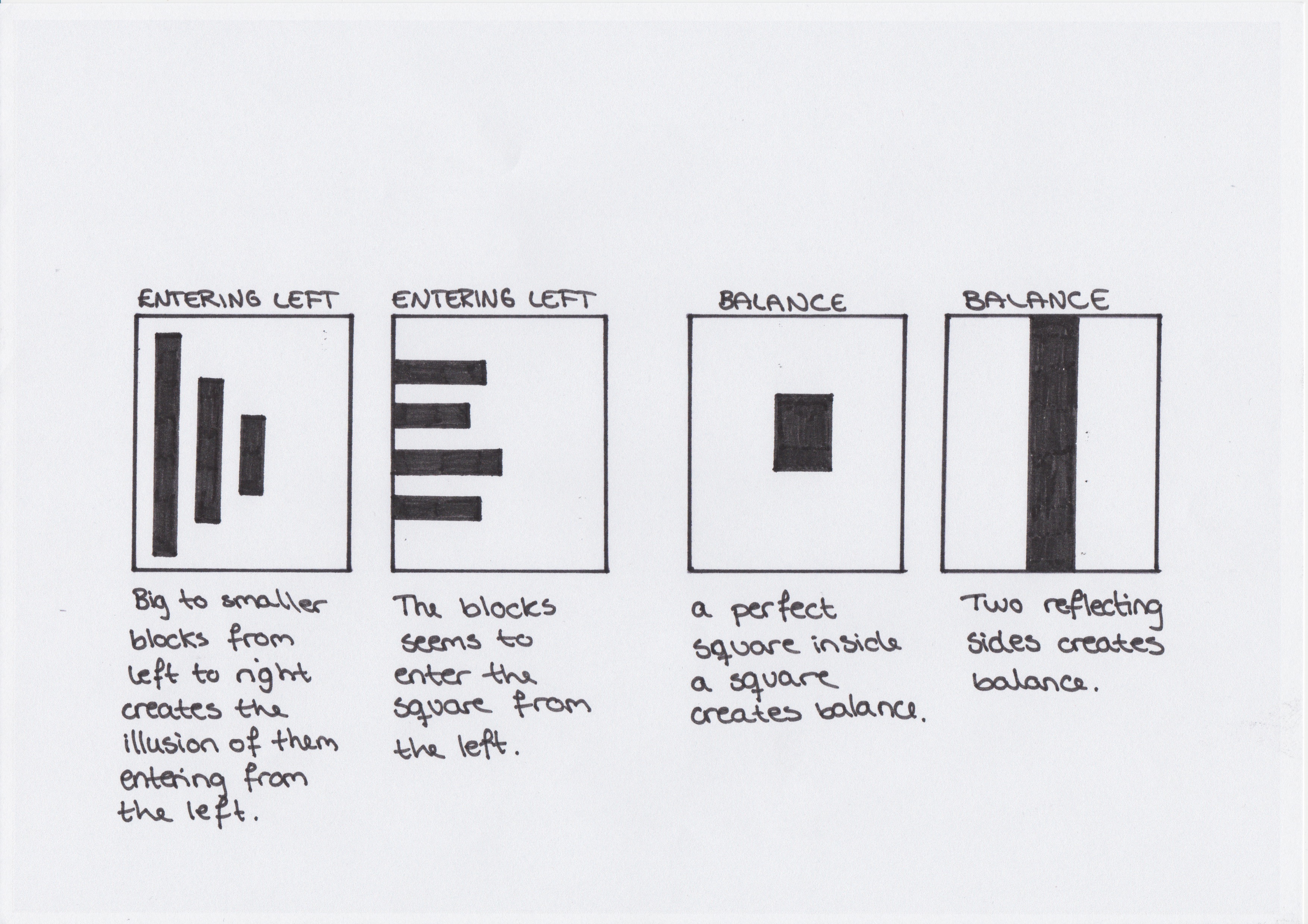
The first of this weeks tasks was to test our idea sketching skills. We were to draw squares on a piece of paper, and draw one or two squares or rectangles in each empty square to achieve the following visual effects.
This is my results:
This week is filled with learning activities, in addition to the mandatory assignments and planning for our exam. I am feeling really stressed out about the amount of work that has to be done in such a short period of time. But there is really nothing else to do, than to dive in, and hope for the best.
I don’t know if anybody noticed, but last weeks learning activity has not yet been posted to my blog. This is due to the fact that my computer broke down, the day before deadline on the mandatory assignment. Just starting the computer would take me about one hour, and than it would take everything from 10 minutes to several hours to do the smallest of tasks on it. But with a LOT of patience I was able to submit the mandatory assignment. It was not completely done, but I can make the final changes to it before I hand it in with the portfolio.
The weekend has been filled with work, and trying to solve the whole computer issue. At the end I decided to buy a new computer, and I couldn’t be more happy with the decision. I bought an iMac 21,5″, and its the most beautiful thing I have ever seen. It listens to all my demands, and executes them in no time!
So even though there is a lot of work to be done this week, I am really excited to get started. Stressed out, but excited.
In this assignment I had to choose a photography from the 19th century, and write a short think piece about it. I chose a photo from a swedish/british photographer called Oscar Rejlander.
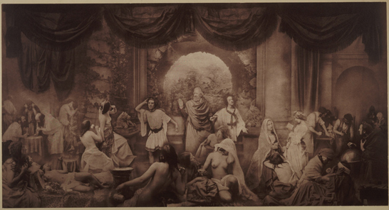
Oscar Rejlander – The Two Ways Of Life, 1857.
This is an image consisting of 30 different negatives, printed onto one large piece of paper. This was the first step towards what we today know as Photoshop and image editing, we owe it all to the experimental and inventive Oscar Rejlander . This technique became popular in the late 19th century, and they called it trick-photography. I chose this photo because I find it sort of amusing to see the humor in these types of photos. It is also quite interesting to see the start of image editing, since it it is so relevant for my study.
Considering this photo, or photos if you like, was made so long ago, it still has a surprisingly good quality. I like the way the photographer uses different light settings and angles on the 30 different models, but still make them go together so good. He gives the photo a lot of depth by placing the larger images in front, and the smaller ones in the back. This also gives the photo a realistic look, even though it consists of many different negatives.
All in all a great photo, and I think it is a important piece in the history of photography.
Image source: http://nationalmediamuseumblog.wordpress.com/2013/07/01/oscar-gustav-rejlander-pioneered-combination-printing/
This weeks first learning activity was to pick three events in the timeline of our lesson “history of photography: An introduction”. We were to find photographs of these events either online, or at a library, and write a paragraph explaining the events in more detail.
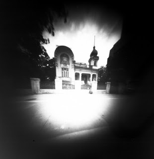
A pinhole camera, or the “camera obscura”, is a simple camera without a lense. It is basically a little black box, with a pinhole in one end. The box has to be all black on the inside, so that nothing reflects the light. Light from the outside of the box will flow trough the hole in the box, and transfer an upside down image of the outside onto a photo paper on the inside. The pinhole camera was invented in the middle ages by a man called Alhazen.
Image source: http://blocktdarkroom.blogspot.no/2012/01/creative-darkroom-making-pinhole.html
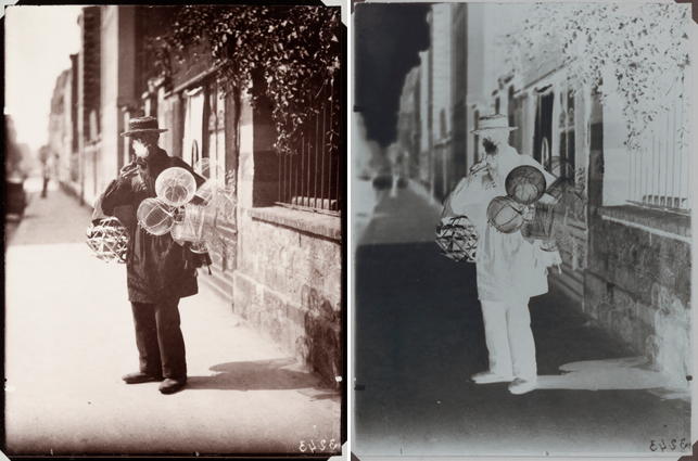
Dry plate negatives was the gateway to hand-held cameras. It was created in the 1870s and was also known as gelatin process. The dry plate, a glass negative with a dried gelatin emulsion, could be stored for a long period of time and absorbed light quickly. This would allow the photographers to develop their photos at a later time, making it simpler for the photographers to work and allowing them to expand their business.
Image source: http://www.moma.org/explore/inside_out/2012/02/07/eugene-atget-black-smoke-and-white-shadows
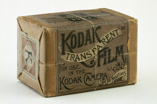
This was invented in 1889, by Eastman Kodak. The great thing about this film was that it was flexible and unbreakable, unlike older films. It saved the photographers from having to carry around portable darkrooms, and made photography accessible for the normal man. It was also possible to roll this film up, so that it didn’t take alot of place, and this gave the photographers the possibility to shoot more photos in one “session”.
Image source: http://therealrevo.com/blog/?p=65027
