In this activity we were to compare a online magazine, blog or website, to a printed magazine, book or journal. We were asked what difference we can see in the strategies used for the two formats.
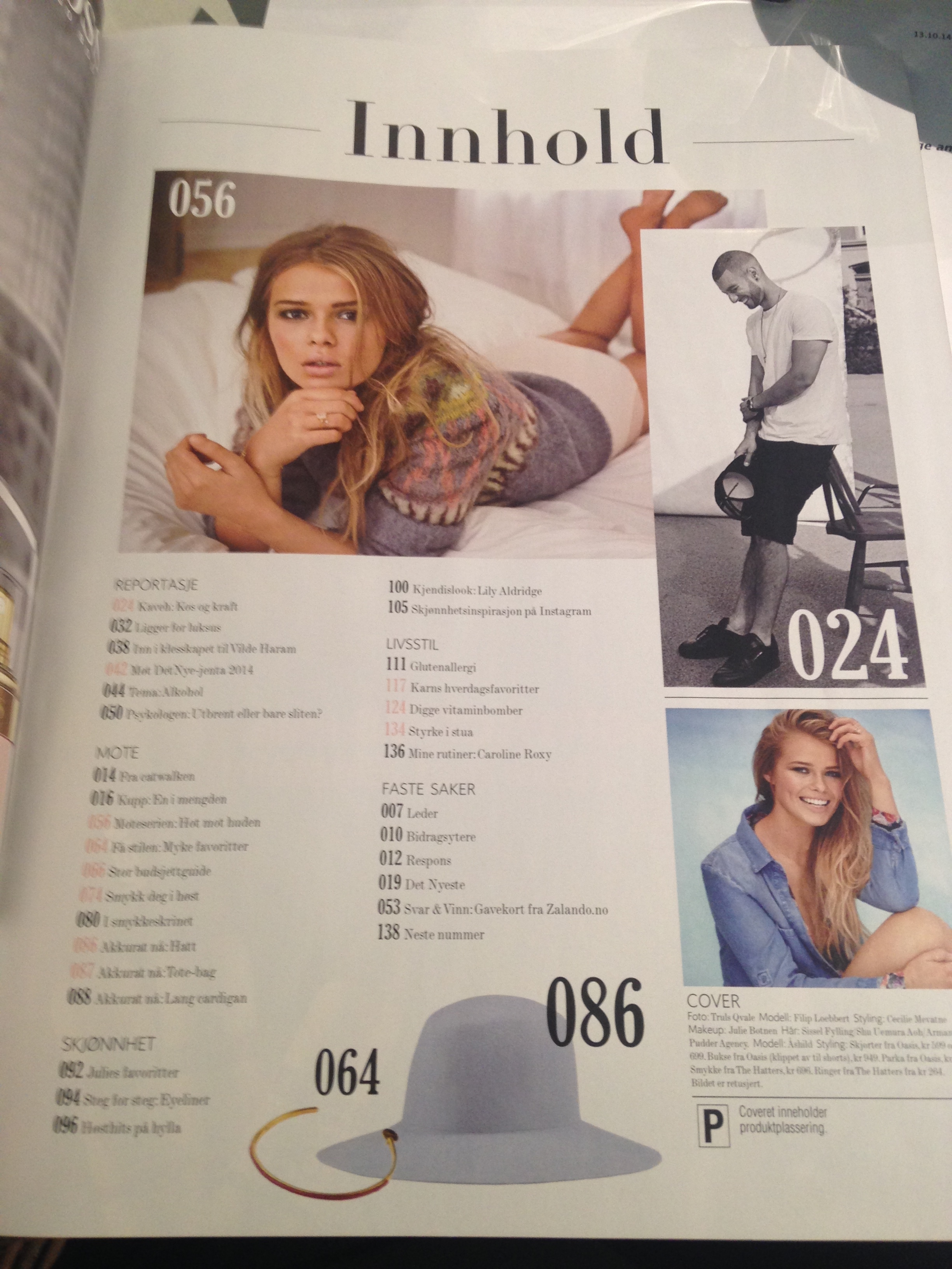
I chose the norwegian magazine Det Nye, both in printed version and the website of the magazine. The main difference between the printed version and the web version, is the layout of the magazine. In the printed one the cover has to include the top articles which you find inside the magazine, and it has to make you interested in reading/buying it.
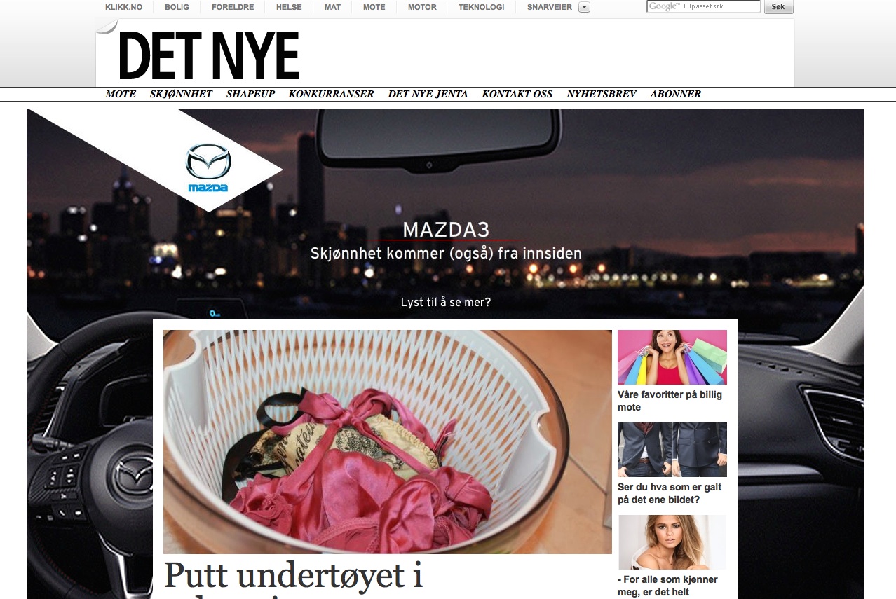
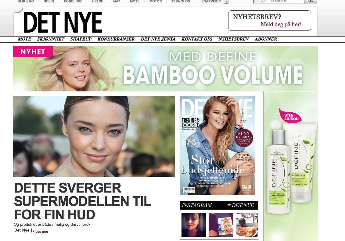
The web version of the magazine is more packed with articles, and I find the homepage kind of unorganized and cluttered. But at the same time it is easy to navigate to the different topics and categories I want to read more about.
Both the printed version and the web version has a clean and simple look, but the printed magazine feels more luxurious. I think this is a part of the strategy of the design, that the printed version should feel more luxurious and special, and the web version is more simple and straight forward.
The one thing I really like about the web version of the magazine, is that the menubar on top, with all the categories of the magazine, stays the same on every page you navigate to. This makes it easy to stay orientated when you look at different articles. The printed magazine is also separated into different categories which makes it easy to find a specific article inside the printed magazine.
Printed magazine


Web magazine